Spot the missing word
How important is a wordmark to a company’s branding? Would you recognise a logo without seeing the name? As companies such as Doritos and Mastercard have chosen to remove the names from their logos, Claire Baldwin looks at what makes brands able to survive on a logo alone.
Another level of brand recognition
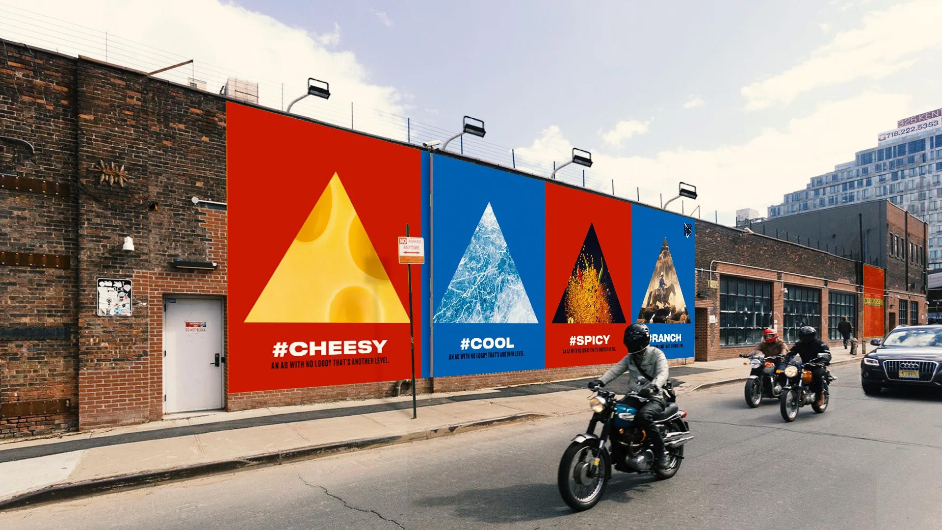
Doritos recently launched a new advertising campaign that completely removed their name from their branding. The ‘Another Level’ campaign was targeted at Gen-Z’s desire to reject traditional advertising, in a world where brands are trying to make their marketing less on-the-nose and more integrated with the digital age.
The campaign includes a TV advert that Doritos referred to as an ‘anti-ad’. It opens with a narrator informing viewers: “For a chip so iconic, we don’t need to name it. ‘Cause this is an ad with no logos, no jingles, no gimmicks. Just those red and blue bags with the stuff you love in it.”
Instead of focusing on the brand and what the product is, the advert instead focuses on how consumers interact with the product itself, such as shaking the last few crumbs from the packet, and getting the tangy flavour powder on their fingers. The ad brings the viewer’s existing familiarity with the product to the forefront of the campaign, stimulating memories and a desire to again experience that “sweet, cheesy, salty, spicy, crispy, crunchy, flavour-packed” snack.

As well as removing their name from their advert, Doritos also removed it from the internet, changing their website and social media handles to “Logo Goes Here”. They shared tweets like “It’s 2019 do people even use names anymore” and “You’ve all been referring to us as “red” and “blue” for forever so might as well make it official”, showing an appreciation of how real people interact with brands.

Logo flexibility for the digital age
While Doritos’ campaign is temporary, several other notable brands have decided to either remove their wordmark completely or focus on using the logo on its own.
Coffee chain Starbucks made its brand design evolution public on a new website, explaining exactly what the vision for the brand is from its use of colour and typography through to tone of voice and photography.

The site explains: “As we evolve to meet beautifully diverse customers all over the world, our brand has evolved too.” This is an interesting and important message for their overall branding, showing that they value inclusivity and growth.
As for the famous Siren logo, the website states: “The preferred approach is to use the Siren logo by itself, unlocked from the wordmark. This allows flexibility to present the Siren with greater prominence while maintaining a considered, open and modern presentation.” This idea of prominence works especially well in the digital age, which often requires logos to be presented on very small screens, which can make wordmarks difficult to read.
Leveraging brand heritage
Similarly, Mastercard has chosen to permanently remove the wordmark from their interlinking circle logo for the first time since its inception in 1968.
Raja Rajamannar, chief marketing and communication officer at Mastercard, stated that, according to research, “more than 80% of people” recognize the logo without the brand name and said: “We are proud of our rich brand heritage and are excited to see the iconic circles standing on their own.”
The change is to create the “modern simplicity” that is required for the digital age and, while the logo looks clean and is still recognisable, not all brands could get away with this.

There are many companies that have survived for decades without the use of a wordmark, thanks to their popularity, strong brand presence, and highly recognisable logos. Examples include Apple, Nike, Adidas and McDonald, who have leveraged their ubiquity, brand lifestyles and distinct logos to create brands that are stronger than words.

Create your own strong brand
While most companies won’t have the instantly recognisable logo success of the examples we’ve just looked at, a strong brand and thoughtful logo design are key to your company’s image.
If you’re looking to create a new brand or refresh your existing logo to better represent your company’s values in the digital age, get in touch with DWH today.
Hidden in plain sight
A LOGO IS MORE THAN JUST A VISUAL REPRESENTATION OF A COMPANY. WHEN EXECUTED WELL, IT’S AN IDENTITY IN ITSELF THAT CONSUMERS CAN CONNECT WITH ON A DEEPER LEVEL. CLAIRE BALDWIN LOOKS AT THE EASTER EGGS HIDDEN WITHIN SOME OF THE MOST WELL-KNOWN LOGOS THAT YOU MAY NOT HAVE NOTICED BEFORE.

FEDEX
Probably the most famous example of the hidden image within a logo is the arrow created by the negative space in between the “E” and the “x” in the FedEx logo.
As a distribution company, this subtle portrayal of movement and speed is right on brand. The design is simple enough that doesn’t detract from the logo, and it’s easy to go years without even noticing this hidden arrow.

PUKKA PIES
Heralded as “the nation’s favourite pie”, you probably see the Pukka Pies logo on a daily basis if you live in the UK. But did you know that there’s a pie hidden inside the “A”?
The brand’s previous logo was simple bold, black letters on an orange background, but the newest design is hiding a tasty treat. At the bottom of the letter is a clear silhouette of a pie, complete with domed top and raised pastry crusts.
This means that by simplifying their logo to just the word “Pukka”, they can still incorporate the pie element without needing the extra text.

HERSHEY’S KISSES
If you’re not familiar with Hershey’s Kisses, they’re individually wrapped chocolate drops made by American confectionery brand Hershey’s.
To get an idea of what a Hershey’s Kiss looks like, just take a look at their logo and turn your head to the left. The space in between the “K” and “I” is shaped just like a Kiss! As with the FedEx logo, this hidden extra has been incorporated into the design so cleverly that the letters don’t look unusual at all.

BASKIN ROBBINS
Famous for having 31 flavours, the world’s largest specialty ice cream shop Baskin-Robbins has paid homage to this special number in its logo.
The logo includes the number “31” by using different colours for the lines that make up the initials “BR”. For an added tidbit, the number itself comes from the brand’s belief that “guests should have the opportunity to explore a fun, new ice cream flavor every day of the month.”

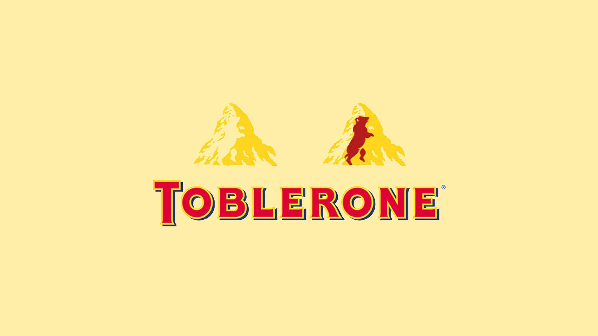
TOBLERONE
Next time you pick one up at duty free, take a closer look at the logo on your Toblerone. Specifically, look at the mountain, and keep looking until you notice the hidden bear.
The chocolate was created by Theodore Tobler in 1908 in the Swiss city of Bern, which has featured a bear on its coat of arms since the 13th century. The mountain shape is inspired by the Matterhorn, which is a peak in the Alps close to Bern. Add these two things together, and you get Toblerone’s logo.

VAIO
VAIO is a sub-brand for Sony’s computer products, and its logo is just a simple representation of the four letters “VAIO”, right? Wrong.
While clearly spelling out the brand name, there’s actually more to it than that. It also represents the integration of analog and digital technology. The “VA” portion symbolises an analog wave, while the “IO” portion mimics digital binary code.

LSO
Similarly, the London Symphony Orchestra’s logo just looks like the brand’s initials written in a single-line flourish.
However, if you look a little closer, you can see the outline of a conductor with his baton, keeping the orchestra in time. It’s admittedly a rather simple representation, but once you notice it, it’s certainly there–and it’s kind of cute!
The changing face of fonts
Font and typeface design can be incredibly important when it comes to creating a certain look and feel for your brand. There’s more to it than simply choosing your from a set of pre-existing fonts, and many brands have created their own bespoke font to really cement their image. Let’s look at some of the more interesting and unusual fonts to have come out of brands and designers in recent months.
The world’s comfiest font
Swedish furniture brand IKEA has taken a step away from furniture design and entered into the world of font design by releasing the free font SOFFA Sans.
Inspired by their online design your own sofa planner, each geometric letter is made up of various configurations of their Vallentuna sofa.
IKEA worked with digital agency Proximity London to create SOFFA Sans, which they are calling “the world’s comfiest font”. While not all of the letters make particularly practical sofas, it’s a fun concept that shows how far-reaching font design inspiration can be.

A new dimension for fonts
Berlin-based type foundry Hightype has released a three-dimensional font for use in spatial contexts.
With emerging technologies like VR, AR, 3D-capable web browsers, Hightype identified a need for standardised 3D fonts for use in design. By working with classic font designers, the design lends itself to being used alongside 2D fonts for a consistent visual experience.
The font is designed to be a base for ideas and modifications. It can be imported into 3D design software and game engines, where the letters can be altered and customised to suit a designer’s requirements.
Variable font technology
Designer Elias Hanzer has created a generative type concept, making use of technology that allows the font to be manipulated.
Titled Phase, the project is aimed to establish exactly what is possible from a modular typeface, as well as to explore the idea that “every visual code or style is is built upon a more or less modular system.”
Made available through a microsite, Phase features a new typeface that is able to react so sound or to manual sliders, allowing the characters to be manipulated. The lines will grow thicker or thinner, and the font will morph from the traditional-looking base font to something more decorative but less legible. Once you’ve created your font, you can download it for use, though commercial applications will require purchase.

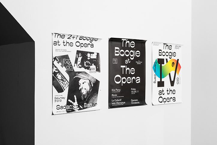
Contrasting font weights
The font Boogie School Sans was released in 2016 by Icelandic and Danish type foundry Or Type. Designed to develop a typeface with a reversed contrast than traditional typefaces, the Boogie School Sans family has since been expanded to include 18 different styles.
These new styles feature varying font weights that offer more contrast in the typeface’s thick and thin lines, creating unusual and interesting characters that still embody the essence of the original font design.
This allows the same letterforms to be used in many different ways, creating contrast and emphasis without changing the actual font.

Fly me to the moon
The world has been celebrating the 50th anniversary of the moon landing with a variety of immersive and interactive events. Claire Baldwin looks at how we’ve been using 2019’s technology to bring this seminal event to a whole new audience.
The Apollo 11 mission to land on the moon was a groundbreaking and era-defining event. Those who witnessed it live will never forget the moment man first walked on the moon. People purchased television sets specifically for the occasion, and friends, family and neighbours gathered in cramped living rooms to watch the event on tiny black-and-white screens.
Now, 50 years on, new projects are allowing new audiences to get a taste of the excitement felt by the world as Apollo 11 was launched, journeyed to the moon, and made its way safely home.
While modern viewers will never be able to fully experience the nervous uncertainty and fear felt as Neil Armstrong, Buzz Aldrin, and Michael Collins headed into the unknown, new immersive technology allows them to learn more about the moon landing and to experience the mission in real time.
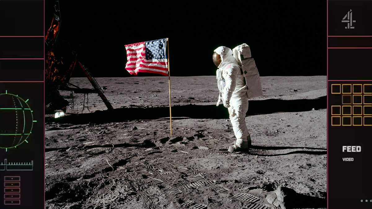
Channel 4’s real-time live stream
Channel 4 partnered with digital specialists Little Dot to live stream the moon landing on their YouTube channel. The stream started at 14:31 BST on July 16th, replicating the exact timing of the real event.
Modern audiences were able to watch the launch ‘live’ in real time, allowing them to experience what it was like on the day. Shorter updates from the mission were also streamed over the next few days, giving viewers some insight into what NASA’s team of astronauts were up to at that very moment 50 years earlier.
The full moon landing episodes are available on demand on All 4 for a limited time.
The Smithsonian’s augmented reality app
Polish start-up company Immersion created an augmented reality app for NASA and the Smithsonian Institution, allowing new generations to experience the moon landing in an immersive way.
Using real images, footage and audio provided by NASA, the app allows users to experience space missions, launch rockets, and explore the lunar landscape. Users can receive notifications with hour-by-hour updates on the Apollo 11 mission to the moon, or enjoy AR simulation games that involve navigating through space. You can even take a selfie on the moon to share on social media, which is possibly the most 2019 way to celebrate the moon landing.
Designed to be intuitive and easy to use for all ages, the app complements the Smithsonian Channel’s six-part television series ‘Apollo’s Moon Shot’ and brings NASA’s space missions of the ’60s to a new audience in an exciting and engaging way.

Apollo Lego Reenactment
On a much smaller (and cuter) scale, art and sculpture creator Attoparsec has been celebrating the moon landing through the medium of Lego.
The artist has created Lego scenes and combined them with quotes from NASA’s Apollo 11 transcript, publishing them on Twitter to produce a real-time reenactment of the moon landing.
Twitter is a great platform for this, as posts can be created and scheduled ahead of time, allowing the creator to stick to an accurate timeline with little effort. It also allows followers to check in with the mission as and when they visit the site, giving a feel for how the public may have interacted with the moon landing through social media if it were taking place today.

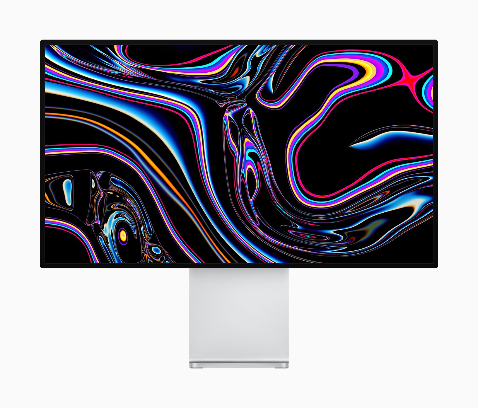
Is Apple's bubble about to burst?
Tech giant Apple have hit the headlines lately with the launch of their new Mac Pro, which comes with a hefty price tag and some costly extras. Claire Baldwin looks at why Apple can charge a premium price on their products and, with Jony Ive’s imminent departure on the horizon, how long it’s likely to last.
The new Mac Pro has been faced mixed reactions. While the specs are pretty impressive, so is the price tag. Another element that has been heavily criticised is the cost of the display’s stand, which many feel is bordering on—or perhaps fully entering—the absurd.
Apple has a bit of a reputation for charging a premium for products that are portrayed as stylish, prestigious and high-tech, but how true is this image to the reality?
Stylish products
Generally speaking, Apple’s products are thought of as being clean, sleek and uniform. But let’s address the elephant in the room: The Mac Pro looks like a cheese grater.
Ikea was quick to point it out in their tongue-in-cheek advert for a grater “Designed for apples”, and the internet has been awash with the comparison. Is it better or worse than the previous Mac Pro’s comparison to a bin? It’s hard to say.
That said, it’s a very clever design. It’s instantly recognisable, making the device almost a logo in its own right, and it’s actually quite sleek and minimal … once you get past the cheese-grateriness.
You could be tempted to say that Apple should have focus-grouped the design a little more before finalising it but, let’s face it, we’re all talking about it. That’s great exposure.

Prestigious products
Obviously, better things are supposed to cost more. We’ve all heard the old adage “Buy cheap, buy twice.” However, a high cost doesn’t necessarily guarantee a quality product.
There has long been a perception of quality and prestige in Apple products. The sheer number of people who own one is both testament to and an argument against this view.


The Mac Pro is priced at $5,999, with the Pro Display XDR coming in at $4,999. The price of the Pro Display stand is a whopping $1,000. While this puts them out of the price range of many people, it’s worth bearing in mind that the Mac Pro is designed for professional end users with high-end computing needs. The clue is in the name.
While critics may say that Apple should create more lower-end products for the everyday consumer, doing so would decrease the product’s perceived prestige, which may hurt the company’s overall reputation.
High-tech products
The consumers that the Mac Pro is aimed at have the need (and the budget) for its high specs. While the average computer user probably can’t afford a Mac Pro, they also probably don’t need one anyway.
That said, it’s difficult to understand how Apple can justify charging one-sixth of the price of a high-spec computer for a metal stand, albeit one that is touted to have incredible height, tilt and rotation abilities.


Apple have always been at the forefront of tech research and development, and they have become both benchmark and inspiration for other companies. When Apple does something, other companies often follow close behind. Let’s be honest. Most smartphones kind of just look like iPhones at this point.
But don’t forget the iPhone 7’s much-lamented lack of a headphone jack, which essentially offered decreased functionality and an increased obligation to rely on Apple products. Other companies weren’t exactly quick to follow this step, and many used it as a selling point for their own, more adaptable phones.
When will Apple’s bubble burst?
People will always poke holes in new releases from any company, and Apple’s high profile and astonishing user base just makes it more of a target for the haters.
While there seems to be consistent criticism of their new products, Apple brand loyalty is on an upswing, and they claim to have 1.4 billion active users of their devices. It’s possible that these complaints are coming from already biased non-Apple users, or that the younger generations who are so used to smartphones and other high-tech gadgets are taking up Apple products faster than the jaded Apple defectors.
Either way, Apple are a great example of how to successfully create brand loyalty that is almost completely unmatched in any other market.

Apple’s changing design department
However, things could be set to change, as Apple’s chief design officer Jony Ive has announced that he is to leave by the end of 2019 to start independent design company LoveFrom. Ive is credited with rescuing Apple from its decline in the ’90s, and has overseen the design of every product since 1992.
Losing such an influential figure could be a huge blow for Apple, and his role won’t be directly replaced. Instead, existing team members Evans Hankey, Alan Dye and Jeff Williams will manage different design divisions.
Ive has stated that LoveFrom will count Apple as one of its clients, so he’ll likely still have some input, but the dynamic and design process will be very different. While Ive has said that Hankey, Dye and Williams are among his closest collaborators and he has “the utmost confidence” in them, will they be able to continue his legacy? Only time will tell.
One thing is certain: The next few years will be pretty interesting for Apple.
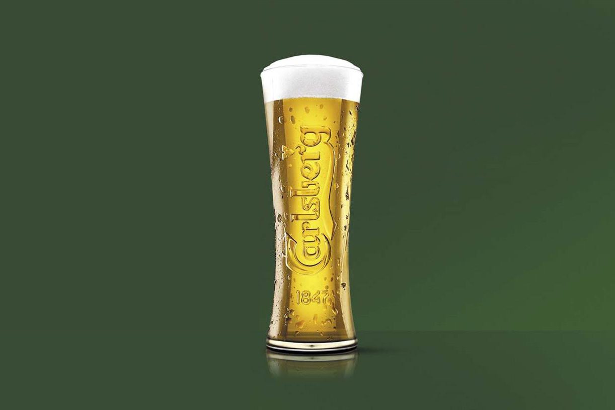
Probably the most honest ad campaign in the world
Continuing our exploration of corporate responsibility in marketing, Claire Baldwin looks at Carlsberg’s new honest stance. With a tone-of-voice overhaul and an updated slogan, can honest marketing increase your brand’s value? Probably.
You’re surely familiar with Carlsberg’s slogan “Probably the best beer in the world.” It’s a little arrogant, it’s catchy, and it gives the audience clear expectations of the product.
However, the Danish beer brand has finally admitted that Carslberg is probably not the best beer in the world. In fact, they’ve gone a step further and, in a bold move of turning negatives into selling points, they’ve shared some of their customers’ harsh comments about their product on social media.
These include claims that Carlsberg tastes like “stale breadsticks” or “drinking the bathwater your nan died in”. Catchy, but not particularly enticing.
The new campaign has turned the original, familiar slogan on its head, stating: “Probably not the best beer in the world. So we’ve changed it.”
Let’s take a look at why it’s created such a buzz.
Honesty is always the best policy
According to Carlsberg’s vice president of marketing, Liam Newton:
“At Carlsberg UK, we lost our way. We focused on brewing quantity, not quality; we became one of the cheapest, not the best. In order to live up to our promise of being ‘probably the best beer in the world’, we had to start again. We’ve completely re-brewed Carlsberg from head to hop.”
This brutal honesty in marketing is as refreshing as a cold pint on a hot day.

While a big part of product marketing is trying to portray a desirable product that alludes to a perceived lifestyle, customers ultimately don’t want to be lied to. You can only go so far in your claims before people notice that you’re not living up to your end of the deal.
No matter what industry you’re in, whether you sell products or services, customers have a certain expectation of your brand. That expectation is deeply rooted in the marketing that you put in front of them.
By acknowledging customers’ negative feedback in such a transparent manner, Carlsberg have held up their hands and admitted that what they’re doing isn’t good enough. Honesty and trust go a long way when it comes to customer relations.
The stats are pretty telling
Take a look at these statistics on reputation management, taken from StatusLabs:
78% of consumers trust peer recommendations while only 14% trust advertising
Let’s face it; we all know that advertising exists to make people buy things.
It’s no surprise that consumers trust their peers over a company’s professionally workshopped slogan. If an advert tells you that Carlsberg is probably the best beer in the world, but your mate tells you that it tastes like stale breadsticks, who are you more likely to believe?
More than 80% of reputation damage comes from a mismatch between the buzz and the reality
If you tells consumers that your product is something that it’s not, there’s bound to be backlash.
People are easy to disappoint, and the more you build up someone’s expectations, the more you’re putting your reputation on the line. Don’t make false claims, and don’t make claims that you can’t live up to.
70% of complaining customers will do business with you again if you resolve the complaint in their favour
This is exactly what Carlsberg’s campaign has set out to do.

By addressing their customers’ (scathing) complaints and publically pledging to do something about the problem, Carlsberg has shown their customers that they are listening. It’s likely that many of the beer’s former drinkers will try the new version simply to see whether the brewery has lived up to its word.

We believe in sincere marketing
Here at DWH, we always tell it like it is, and we’d never encourage you to do anything but. We’ll work together to get to know your brand’s strengths and ethos, ensuring that all of your marketing collateral is in alignment.
Get in touch now to discuss your next marketing campaign.
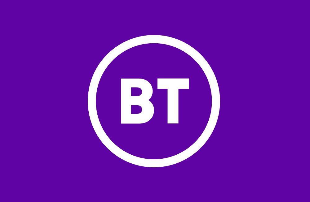
New BT brand comes "full circle"
One of the best things about being a long-standing company is the public’s connection with your brand. Unfortunately, this can throw a spanner in the works when it comes to rebranding. Claire Baldwin looks at BT’s new logo and whether it’s a misstep or a step in the right direction.
BT filed a trademark application last week for a new logo, which is simply the letters “BT” in a circle.

As the redesign has been in the works since 2016, the company has received criticism for the uninspiring result. Graphic designers, members of the public and even other companies have dissed the design, including Poundland’s Twitter jab: “we’ve just spent a £1 updating our logo to be just like yours.”

Haters of the new logo may be pleased to learn that the new branding is apparently still being finalised. However, given how little it has changed since its first appearance in 2016, it looks like BT is pretty set on the simple circle.

BT’s logo history
Since being privatised in 1984, BT have sported a few different logos, reflecting changes in both their company and in contemporary design trends.

Back when they were British Telecom, the original logo was a simple blue T in a circle, designed to resemble a telegraph pole. It was a fairly clean design but didn’t present much in the way of brand identity.
In 1991, the company rebranded as BT and revealed their new logo of “BT” accompanied by the blue-and-red Piper. Apparently intended to represent the empowerment of the consumer, some said it looked like the company was blowing their own trumpet.
The Piper stuck around for a few years until the multicoloured ‘connected world’ globe icon replaced it in 2003. This logo better represented BT’s more modern service, with mobile, internet and TV packages bringing people together. It also fit well with the trend of creating spherical logos in the mid-2000s, championed by the likes of Xbox and Sony Ericsson.
The curse of modern design
A big issue that brand managers come up against these days is the necessity for logos and designs to work in a vast array of different media. Designing the logo isn’t the end of it; every use of the company branding has to be considered.

While thinking about how branding will look on tangible objects like business cards, storefronts, uniforms and vehicle livery has been standard practice for decades, modern consumers interact with brands in many different ways on a near-constant basis.
How your logo will be viewed on a website, social media stream or banner advert on a mobile device are more modern challenges. These smaller, more fleeting appearances of branding mean that the impact of delicate, detailed designs is lost and, as such, they are falling out of favour.
In the never-ending battle for attention and online real estate, simple logo designs have been taking over, giving consumers more breathing space and a better appreciation of the message behind the branding.
Coming full circle
Usually, when the public bemoans a veteran company’s new logo, it’s because they feel it has strayed from their brand identity or thrown away years of heritage. BT’s critics are no different.
While at first the new BT logo looks like a bit of a cop-out, it actually feels like a combination of the company going back to their roots while embracing modern design trends.
The new design has a crisper, more modern feel, but it’s pretty similar to the capital-T-in-a-blue-circle logo of 1984. What builds on heritage more than returning to your original logo? And at least the new version has both of the company’s initials in it!
The complete removal of any reference to what the company actually does is also testament to BT’s confidence in their brand. After all, there’s no mistaking what company it represents. It might not be a groundbreaking design, but there’s no denying that it gets the job done.
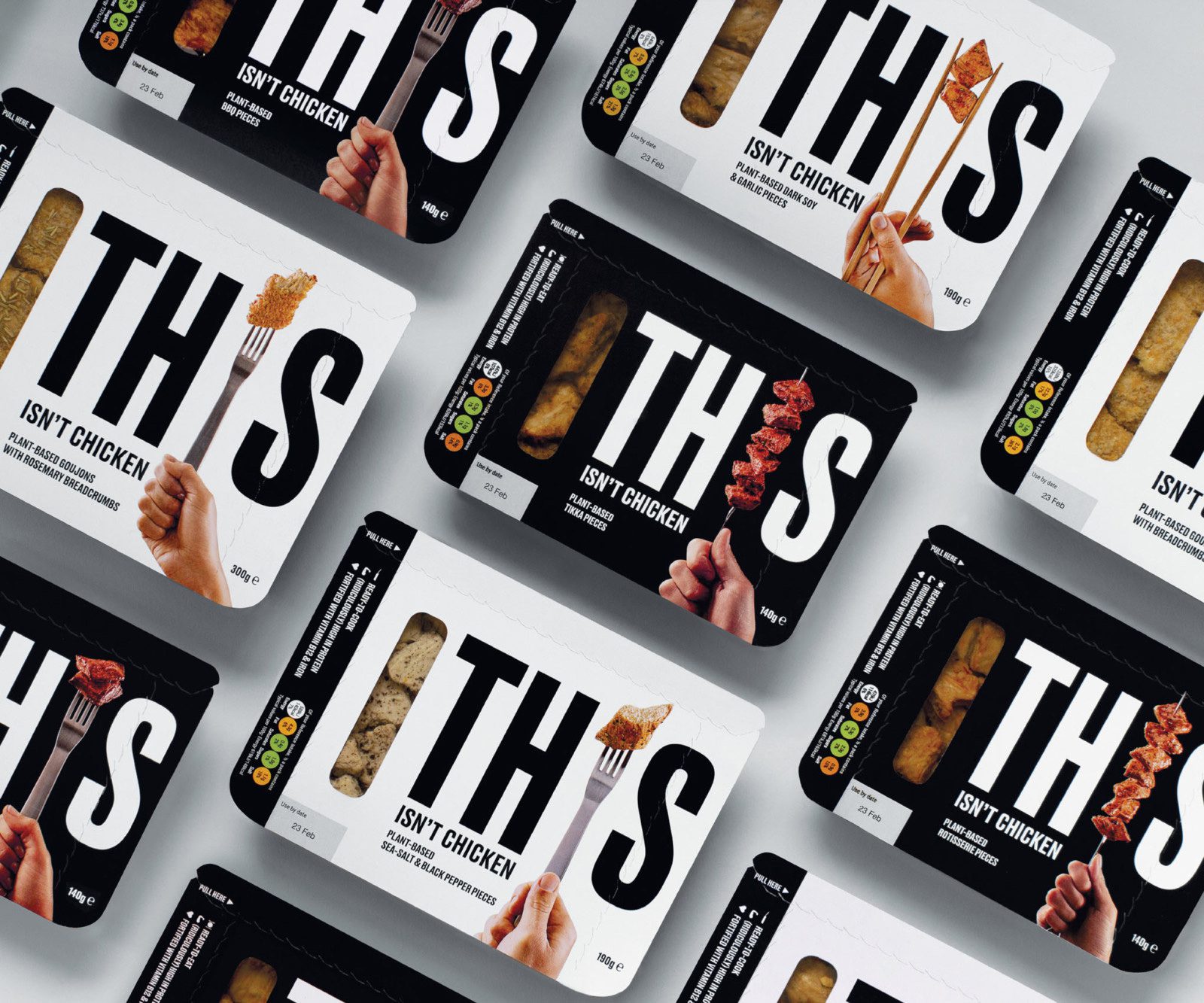
THIS is branding
With the ever-growing call to arms to address the threats of climate change and the shift towards a healthier vegan lifestyle, Claire Baldwin looks at some of the brands leading the change in the use of brand messaging, product innovation and downright honesty. In this first article, we’re checking out plant-based food brand THIS.
It’s 2019, and veganism is growing daily. At the start of the year, Veganuary saw a record-breaking 250,310 people from 190 countries register for the month-long plant-based pledge. For the first time ever, health was the major reason cited for participants’ decision to pledge (46%), followed by animals (34%) and then the environment (12%).
Despite this increase in veganism, there is still somewhat of a stigma around the lifestyle choice, with many omnivores scoffing at the notion of vegan food and proclaiming that it’s not for them.
Enter THIS.
What is THIS?
“THIS is what happens when two meat-lovers checked out meat-free food, and decided that we didn’t want any of it.”
Created by two former burger restaurateurs, THIS is a vegan food company that’s set to change the way we think about plant-based foods.
The website states: “It’s ridiculously high in protein, it tastes sensational and it’s produced by people who won’t guilt-trip you if you also eat meat.”
While many people still harbour the notion of preachy vegans telling them that their lifestyle choices are wrong, THIS aims to push the other reasons why you might choose their products over meat.
The message behind the brand is ‘plant-based food for everyone’.
Why does the message work?
The creators of THIS, along with Johnson Banks, who spearheaded their marketing campaign, aimed to tempt people with the benefits of their product, rather than trying to scare people off meat or shame them for eating it.

Together, they worked to create “a provocative, challenging tone of voice that embraces and promotes the idea that meat is no longer a necessity”.
The simple monochrome branding and the emphasis on the ‘naked’ product allows THIS to speak for itself. There are no fancy graphics, no lifestyle shots, and no artfully constructed serving suggestions. It’s just THIS.
Creating a focus
The creators of THIS have focussed their campaign on three main aspects that are of utmost importance to consumers: the taste, the environment, and the animals.

The taste
It should go without saying that taste is a key factor for food marketing, but vegan brands are often faced with an uphill battle against omnivores who think that vegan food is bland or boring.
In response to the question “What does THIS taste like?” the website’s FAQs playfully state: “Meat.” It’s a pretty clear and concise answer.
The environment
The packaging of the entire range features some handy graphics of the environmental impact of THIS versus other meat products.
Check out the graphs on their website for statistics of water consumption and CO2 production for THIS compared to beef, chicken and pork.
The animals
THIS’ website states that it’s “a bunch of food that allows you to virtually eat meat, without killing stuff.” It’s perhaps not the most delicate of statements, but the very matter-of-fact delivery of this message is what makes it so compelling.
When you put it that way, why not eat THIS instead of meat?
What have we learned?
The marketing for THIS is noteworthy because of its simplicity. It focuses on what the product is, and what it isn’t. And nothing else. There are no gimmicks, no false promises, and no distracting set dressing.
What THIS does is take what consumers care about and deliver it to them in a clear, no-nonsense manner, which isn’t something we can often say about marketing campaigns. The message is clear: THIS is not meat. It’s even better.
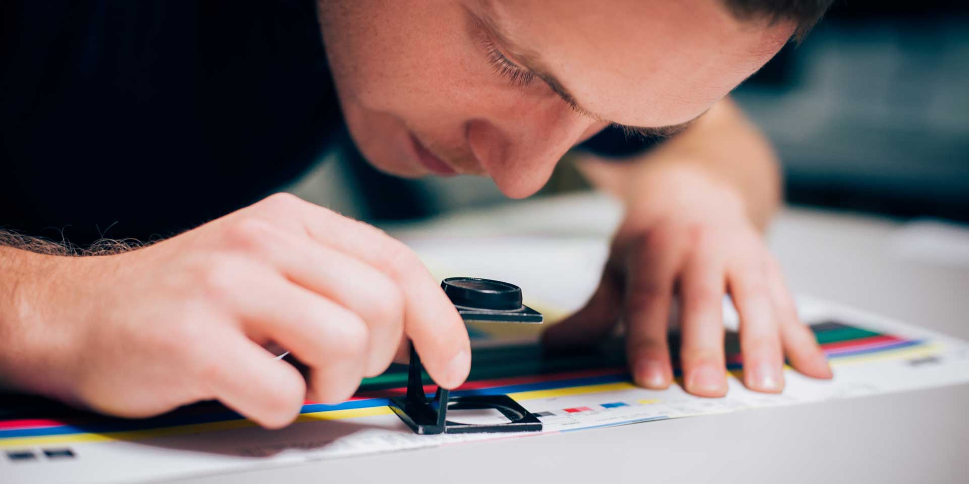
Impress your print company with your knowledge of printing terminology
Following our rundown of the essential graphic design terminology that will help you to better describe what you want, we’re taking a look at sprint-specific terms. Whether you’re printing flyers, hardback books or catalogues, knowing what you’re talking about will help you to ask for the right things from your print company. Here are some of the most common printing terms that you should know.
Binding
Binding is how the pages of a book or brochure are held together. There are many choices, which are suitable for different numbers of pages or particular aesthetics. Common types of binding include saddle stitched, perfect bound and hardcover (also called case bound). Take a look at this great resource for some visualisations.
Bleed
Bleed is a buffer to allow for movement during the printing and cutting process by extending the design past the crop marks. In most cases, printers require a 3mm bleed around the edge of each page to prevent white lines around the edges. This means printing on a larger size of paper than the required end result, as the sheets will be trimmed.
CMYK
While digital design uses RGB color (Red, green, blue), CMYK (Cyan, magenta, yellow, black) is preferred for print media. Traditional lithographic printing presses use individual plates of each of these four colours to create the final shade. If you use Pantone or spot colours, you should bear in mind that there may not be an exact CMYK colour match for litho printing.
Crop or trim marks
These are lines printed in the corner of each page to show the printer where to cut the paper for the finished size. They usually cut through the bleed to ensure proper printing of the design.

Die-cut
This process is often used when you require a specific shape to be cut out of your printed sheet. You might want patterns or letterwork cut from the centre of the page, a shaped outline, or any number of creative options. The process is done by moulding a metal cutter (die) for the desired shape, so it can be costly if you require something bespoke.

Embossing and debossing
Embossing is the creation of a raised design by pressing a die into the paper. Debossing follows the same principle as embossing, but the design is recessed rather than raised.
Foiling
Foiling is the process of adding a shiny, metallic finish to a particular area of your design. You may choose to foil your logo, your business name or design elements to make them stand out. Foiling comes in a variety of colours, including a holographic finish.
Folds
Particularly useful for leaflets, it’s important to know the different ways that your printed material can be folded to create the effect you want. Concertina or Z-fold is when the paper is folded back and forth, creating a zig-zag. Gate fold is when the left and right edges fold in to meet in the centre. Roll fold is where the paper is folded multiple times in the same direction, like folding a letter or takeaway menu.

GSM
GSM stands for “grams per square metre” and is used to define the weight or quality of paper. GSM is not a measure of thickness, though the two often correspond, so you should always request samples to get a good feel for the paper. If you’re interested in thickness, this is measured in microns.
Laminating
While you’re likely familiar with this in an office setting, print laminating is a much more subtle finish. Lamination adds a thin layer of plastic to the surface for durability. It is available in a range of finishes, including gloss, matt or soft-touch, which gives an almost velvety feel.
Lithographic printing
This traditional type of printing press uses plates and ink to apply colour to the paper, and is commonly used for mass printing of documents with graphics that need to look sharp. While lithographic printing dates back to the 18th Century, modern litho printers are much more advanced.
Offset printing
This is the most common and cost-effective method of commercial printing. The inked image is transferred (or ‘offset’) from a laser-etched plate to a rubber blanket, which is then pressed onto the paper. It is ideal for creating large volumes of high-quality prints, such as magazines, newspapers and brochures.

Pantone
The Pantone Color Matching System is a largely a standardized color reproduction system, created by the company Pantone. Pantone colours use 13 base pigments (14 including black) to create a broad range of shades. This means that they can’t always be exactly reproduced in CMYK or RGB.

Process colour
This is a type of colour that is made by layering a series of dots in different colours over each other to create a particular shade. This is how CMYK colours are printed, with a pass from each of the four colour plates. If you view process colour printing under a microscope, you can see the tiny dots that make up the colour.
Proof
A proof is a visual representation of the final project, either as a hard or soft copy. Carefully checking proofs before they are sent to print is essential to avoid costly mistakes. You may be given several proofs to check throughout the design process, allowing amends to be made before the final proof is signed off. When checking PDF proofs, be aware that your screen may not show colours exactly as they will appear in print.

Spot colour
A spot colour is one that is printed in a single run, rather than process colours, which require layering of different hues. In spot colour printing, each individual colour will require its own lithographic plate. There are many spot colour classification systems, the most well-known of which is Pantone.
Spot UV
Spot UV is a glossy finish that is applied to certain parts of your design to make them stand out. It creates a slightly raised surface and catches the light, giving a subtle yet impressive effect. It is often used on a dark-coloured matt background, and it works best on coated paper.
Stock
Stock is the term for the paper or card on which your design is to be printed. There are many different types of stock, which vary in quality, intended application and finish. Some examples include cover stock, which is a thicker, more durable material used for outer covers, linen stock, which has a luxurious, textured feel, or coated stock, which has a smooth, glossy finish. This list of stock terms has more useful examples.

My DWH story
Continuing our series of DWH Stories, Claire Baldwin gives us the lowdown on her copywriting journey and how she came to work with DWH.
I’ve been working with DWH for nearly a year now, writing articles, proofreading documents, handling social media and basically tackling the agency’s word-related needs.
I’ve known Dave for about 15 years and I had no hesitation when he asked if I’d be able to provide him with some support. He’s one of the kindest and most enthusiastic people I know, and he’s really dedicated to his work. You’re in good hands with Dave!
Following my dream
I’ve always known that I wanted to be a writer in some form or another. I have a degree and an MA in Creative Writing, both from De Montfort University, and I’ve had both creative and academic work published in a couple of books and magazines.

I graduated from university and tumbled straight into the murky depths of the recession, which was a very unfulfilling welcome to the world of work. I had a lot of temporary jobs in the following years because people weren’t exactly focusing on hiring creatives during the recession.
Making ends meet
This meant that I had to take pretty much anything I could to get by before working on actually getting into writing. I was a cleaner, a receptionist (twice), and I had three jobs in accounts receivable—none of which was what I was expecting to use my Creative Writing MA for!
Eventually, I scored a great temporary job copywriting for Boots, writing the product descriptions for their Christmas line. It took me over 100 job applications to get there. I was then able to get my first permanent job at a digital marketing agency and I stayed there for about three years. After that I was an in-house copywriter, before moving to another content-based role at an agency.


Something missing
While I enjoyed many of the positions that I’d held over the years, I always felt that there was something missing and that I wasn’t able to make full use of my talents. I had toyed with the idea of freelancing shortly after leaving university, but had been put off by the hard work. I just wanted to find a normal job that didn’t require worrying about where the money was going to come from and how much of it needed to be put aside for tax.
Everything that I learned during my time at ‘normal’ jobs prepared me well for finally taking the step towards freelancing. Initially, I worked part-time at a small digital marketing agency for around the first year of my freelance business. This helped me to pay my mortgage while developing my business, as well as giving me additional experience. However, I wasn’t properly applying myself to the pursuit of freelance work, as I was fairly stable financially. If I had quit my full-time copywriting job to pursue freelance straight away, I would have perhaps approached things differently.

Goodbye, safety net!
Eventually, it was time to part ways with my temporary job and properly focus on expanding my business. I had more time to go to networking events, build up my social media and try to develop my network of contacts both in person and on LinkedIn. Before long, I had a pretty solid base of clients requiring both regular and ad-hoc copywriting.
This is also around the time that I began working with DWH. Initially starting with the occasional article (Check out my blog archive!), the relationship developed to the point that I now work two days per week exclusively for DWH. I write articles and social media content for both the main brand and our clients, as well as proofreading and writing those odd bits and pieces that need an expert eye.
Working with DWH has allowed me to work on new and interesting projects, such as proofreading Abbeywood Estate’s stunning brochure, delivering social media training, and performing content audits to see where existing websites can be improved for usability and SEO. Every day is different and there are lots of exciting things on the cards in the future.

A dedicated team
Dave has done a great job of building up DWH to be a full-service digital agency by bringing on board people that he knows are experts in what they do and, perhaps more importantly, are passionate about doing them. Every project at DWH is handled with enthusiasm and a keen eye for detail, leading to great results that make our clients happy.
I’m proud to be part of such a dedicated team that helps companies to share their stories and achieve their goals. Looking to the future, I’m excited to see what other projects DWH will get to work on as the company continues to grow and develop.