
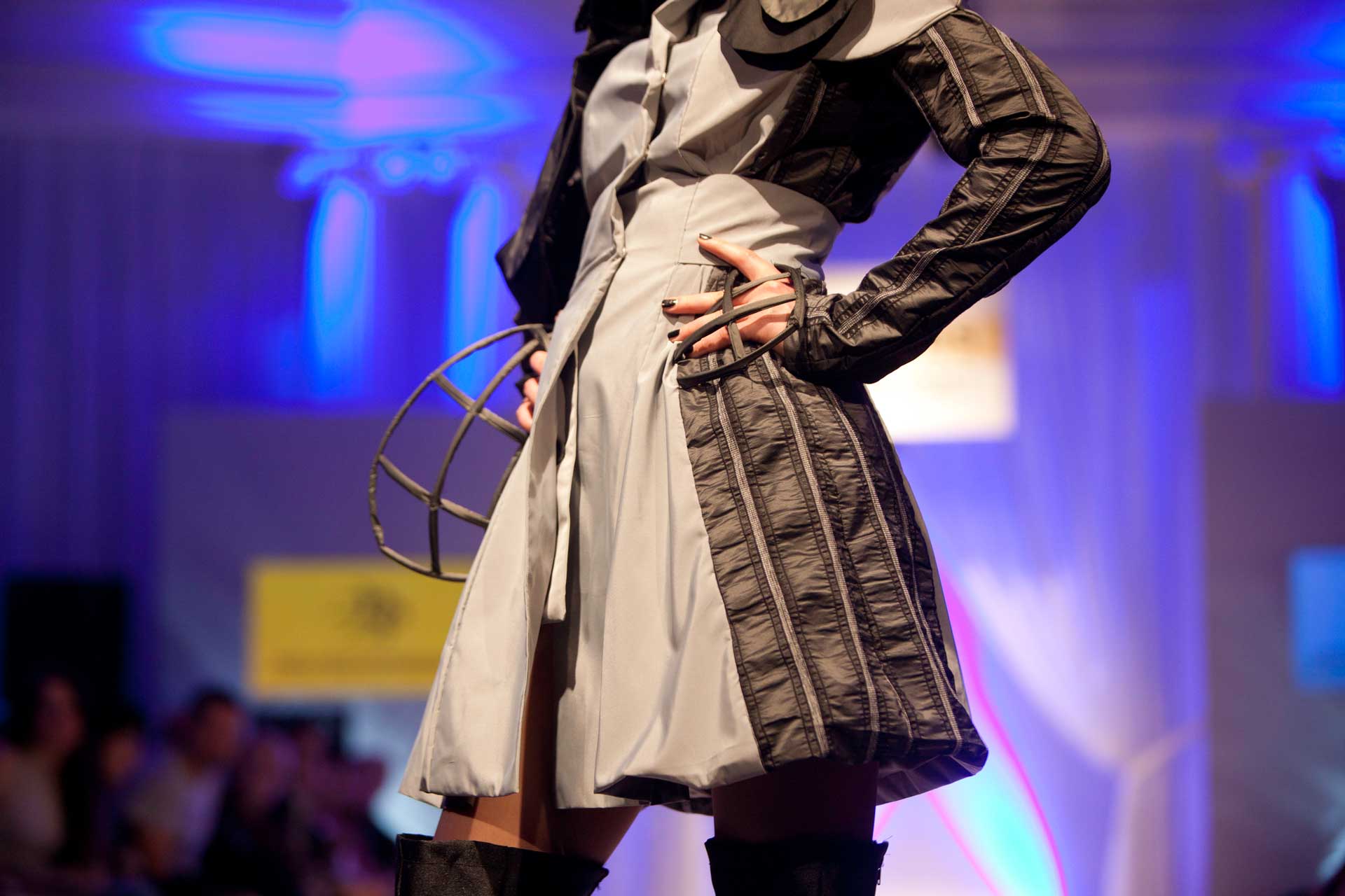
Impress your graphic designer with your knowledge of design terminology
Whether you’re an Account Director at an ad agency, an in-house Marketing Executive, or a client, the barrier between knowing what you want from your marketing collateral and trying to explain this to your designer can be infuriating. Help is at hand as Claire Baldwin breaks down some basic terminology that will bowl over your designer at your next meeting.
When you’re working with a graphic designer, you sometimes come across elements of the design that you’re not quite sure about but don’t know how to explain why. A basic knowledge of graphic design terminology can help you to better explain amendments rather than saying “It’s just a bit … you know. Can you make it look cleaner? I’ll know what I want when I see it.”
Typography
Copy
Copy is the proper term for the text part of a design or layout. There are various different bits of copy that you can refer to, such as body copy, which is the main bulk of the text.
Serif or Sans Serif Font
A serif is the decorative stroke or curve at the ends of lines on letters. These can be elaborate or quite basic. Think Georgia or Times New Roman. The word ‘sans’ is Latin for ‘without’, so these fonts are plainer and don’t include the extra flourishes. Think Arial or Calibri.
Kerning
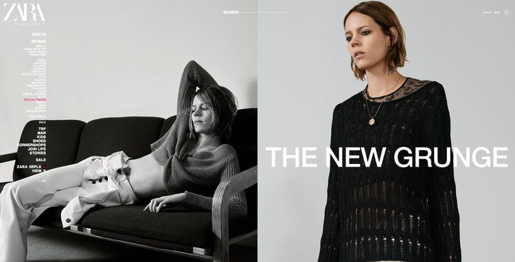
Kerning is the amount of space between two individual letters. It’s used to create a pleasing balance of space between each character. Check out our article on Zara’s new logo design for an example of extreme kerning.
Tracking
While kerning concerns the spaces between individual pairs of letters, tracking is the overall spacing of a group of letters. Normal, tight and loose tracking can be used to adjust the visual density of a block of text.
Leading
Leading (pronounced like the metal) is the space between lines of text. You might have seen this in word processing and design software as ‘line height’ but this is the proper typographical term. Tight leading can make copy difficult to read, while loose leading can cause copy to look sparse.
Layout
Hierarchy
Hierarchy is the arrangement and design of elements by importance. This is often broken up into levels, with Level One being the most important element, such as the title, followed by Level Two, which might be a subheading or image, while Level Three might be the body copy.
Orphan
When dealing with copy, single words or short lines can sometimes fall at the end of a paragraph or column, causing an uneven appearance. This lonely-looking bit of text is called an orphan.
Widow
The term widow usually refers to either a line that ends a paragraph but falls at the top of the following page or column, or a line that starts a new paragraph but falls at the bottom of the page, splitting it from the rest of the content.
White Space or Negative Space
While it’s referred to as white space, this term refers to any area of the design that is left blank, so it can be any colour. White space can give a design room to breathe and stop things from feeling cluttered. It’s tempting to want to ‘make the most of the space’ by filling it with something, but white space can be a very effective use of space.
Branding
Logotype or Wordmark
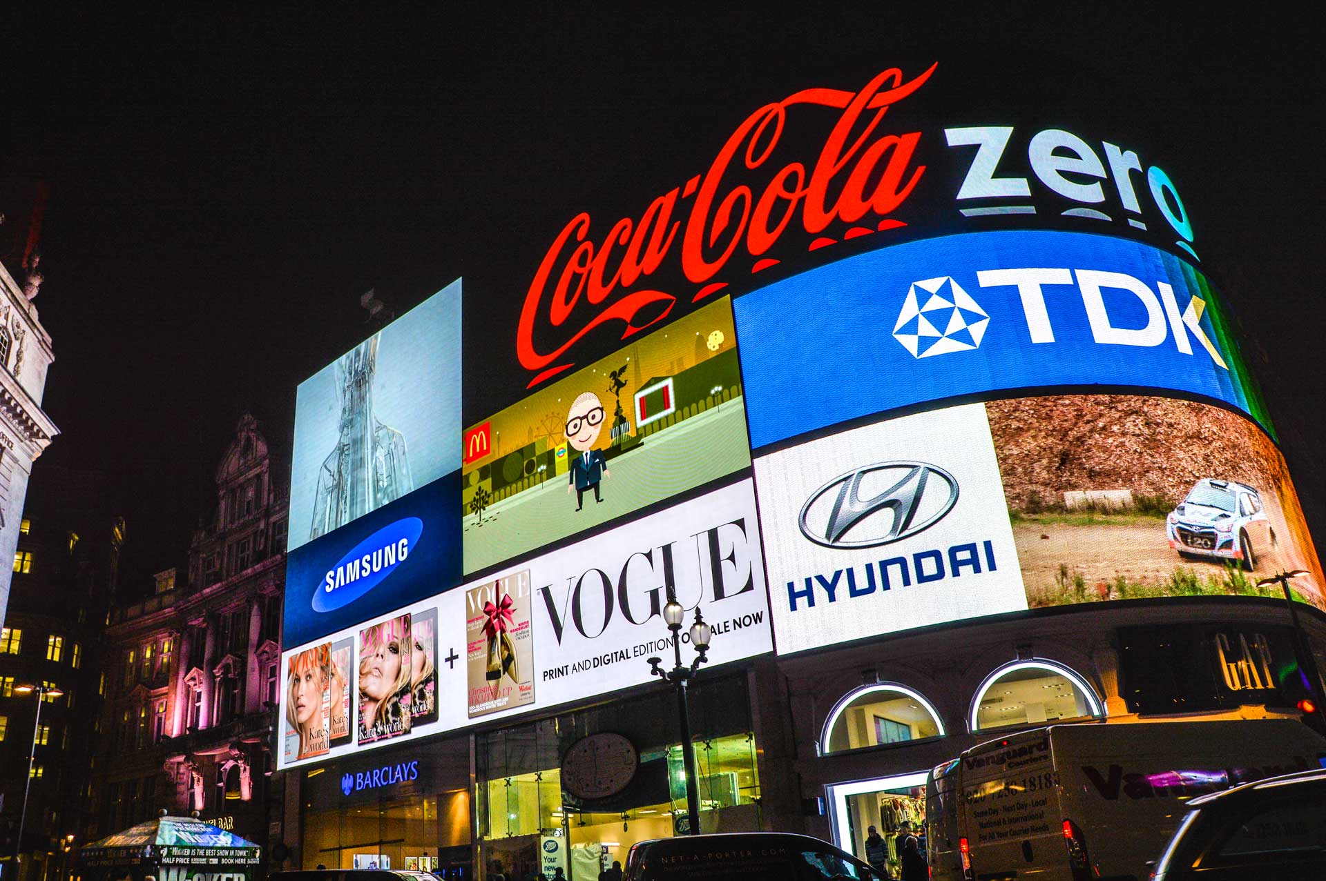
When referring to a company’s logo, people are often talking about their logotype or workmark. This is a visually unique representation of the company’s name for branding purposes. Think Coca Cola, FedEx, Disney … basically any company logo that’s a stylised version of their name.
Logomark or Brandmark
This is a type of logo that doesn’t contain the company name but instead uses an image or symbol to represent the brand. So instead of the company name “Apple”, you usually just see the apple-shaped logo. Brandmarks can be accompanied by a logotype, but often stand alone for simplicity.
Thumbnail Sketch
This is a quick drawing of a potential concept, allowing the designer to share lots of different ideas without having to spend too much time on those that will be discarded. While it’s called a sketch, this might be a digital design created on the computer but without the full care and attention that a final design would receive.
Are two brands better than one?
After we were presented with a brief to create some dual-branded material for one of our clients, Claire Baldwin conducted some research into the winners and losers in the world of dual branding. The results are in.
When done well, brand partnerships can be hugely beneficial for everyone involved. Unfortunately, there are also plenty of opportunities to ruin the reputations of both companies.
Let’s look at some dual branding and see what makes a good collaboration.
Spotify and Uber
One factor in the success of dual branding is both companies having similar objectives and target markets. This was definitely the case for the collaboration between music streaming service Spotify and taxi service Uber.
Spotify announced in 2014 that premium account holders would be able to stream their own playlists during Uber rides. This enhanced the experience of riding with Uber and also encouraged Spotify users to upgrade their account to benefit from the collaboration.
By understanding the whims and interests of their target markets, rather than just their needs, Spotify and Uber managed to create a successful collaboration that was beneficial for both companies, as well as their customers.
Covergirl and Star Wars
When you think of collaborations, makeup brand Covergirl and sci-fi franchise Star Wars don’t necessarily seem like the best fit. However, when Covergirl released a Star Wars collection to coincide with the 2015 release of The Force Awakens, it was a huge success.
The limited edition range featured lipsticks and nail polishes in bold, sci-fi shades, and even mascara with iconic Star Wars quotes on the tubes (Of the 10 choices I’d opt for: “Do. Or do not. There is no try.”).
A makeup collaboration at the time of the original Star Wars movies in the ’70s would likely have been a flop, as the movies were seen to be ‘for guys’. However, modern audiences and cultural shifts allowed Covergirl to take advantage of a crossover audience that didn’t exist at the time of the original movies. And with The Force Awakens’ strong, female protagonist Rey, the joint branding felt all the more appropriate.

Shell and Lego
Both being Danish companies, the partnership between Shell and Lego seemed to make sense when it first started around 50 years ago. Lego created Shell-branded petrol stations and race cars in its toy range, benefiting from added realism and access to Shell’s supply streams. Shell got its brand exposed to new customers from a young age and was able to convey a family-friendly image.
However, with increased global awareness of some of Shell’s less-than-environmentally-friendly practices, the suitability of the partnership was called into question. In particular, people asked whether Shell was an appropriate brand for children to be so blatantly exposed to from such a young age.
Greenpeace put heavy pressure on Lego to cut ties with Shell, and the accompanying public outcry eventually led to the end of the partnership.
So what makes good dual branding?
Dual branding seems to work best when:
the brands have complementary audiences
both brands have similar ethics
there is a clear objective or goal
the collaboration benefits both brands as well as their customers
However, success can be hard to predict. Collaborations that sound perfect can sometimes fall flat, and those that seem doomed to fail can turn out to be wildly successful.
It’s important to think about what your aims are with dual branding and not to jump into a partnership without considering how it will affect both brands and their audiences.
Flatter to deceive
There’s no such thing as an original idea. We hear this all the time. You come up with a brilliant idea, or you write that killer tagline, only to find that somewhere along the line someone has done it before. So, when does inspiration become plagiarism? Claire Baldwin explores the differences between the two and investigates what can be done to avoid the situation.
Inspiration vs plagiarism
One of the biggest fears for designers is having their work stolen or copied.
Creativity can’t exist without inspiration: artists inspired by nature, musicians inspired by other musicians, filmmakers inspired by real-life stories. By reacting to this stimulus and combining it with our individual ideas and experiences, we create something new.
However, it’s hard to tell when inspiration ends and theft begins. While it’s an important part of the process, you should never let inspiration become imitation.

Tokyo 2020 Olympics
The Japanese Olympic Committee made headlines in 2015 after revealing the Games’ official 2020 logo.
Kenjiro Sano was accused of stealing Belgian designer Olivier Debie’s 2013 design for the Théâtre de Liège. Debie undertook legal proceedings for copyright infringement due to the similarity of Sano’s work.
Comparing them side by side, it’s clear why Debie was unhappy. Sano claimed to have never seen Debie’s work, but further allegations of plagiarism surfaced from his past work and the logo was scrapped.

Solo: A Star Wars Story
Last year, posters for the ‘Star Wars’ spinoff ‘Solo: A Star Wars Story’ attracted media attention for their similarity to a series of Sony Music France album covers.
Created by Hachim Bahous and released in 2015, the album covers feature large, colourful typography and graphics, which are almost exactly replicated in the Disney designs. While this could be considered coincidence, the posters even use the same colour scheme.
Bahous said: “I am flattered that the quality of my work is recognised, but it is still pure and simple forgery, I have not been asked for my permission, I wish to be credited and paid for this work I have done for Sony!”

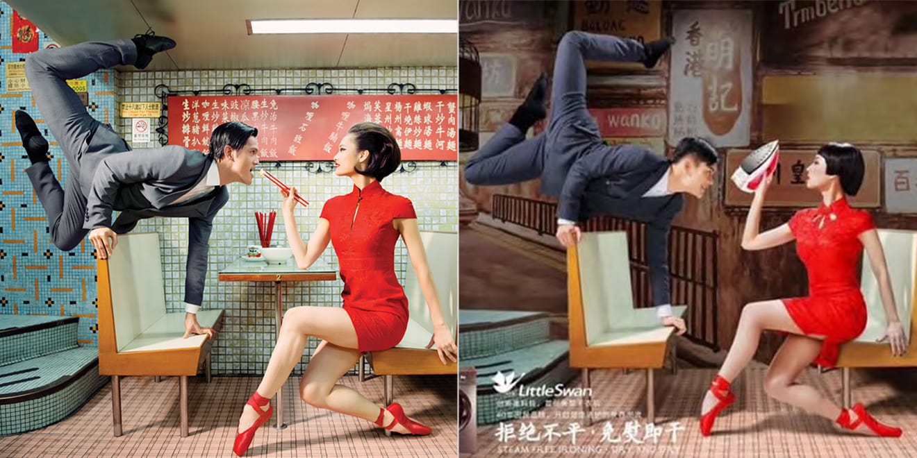
Little Swan
This year, Chinese washing machine manufacturer Little Swan was criticised for stealing adverts created by Design Army for the Hong Kong Ballet.
In a series of ads, Little Swan almost exactly replicated the artistic shots used for the Hong Kong Ballet. They included ballet dancers wearing the same outfits, and even copied and pasted portions of the original images.
While China has long been known for its copycat culture, it’s hard to understand why Little Swan would copy the adverts so precisely with so little connection between ballet and washing machines.
How to avoid design plagiarism
With the current media saturation, being consistently original can be a tall order.
Here are some tips to avoid accidentally copying something, or creating something so generic that it’s hard to tell if it was copied or not.
Avoid the familiar
Try to create something unusual, as you’ll have more chance of this being a unique design.
If something seems like ‘the obvious choice’ then steer clear! You might accidentally copy something or just end up creating something really dull.
Do your research
Do whatever you can to check that your idea doesn’t exist. Search online, look at design books, and hunt through trademark databases.
Don’t limit yourself to the sector or medium you’re working with, as common designs can be found almost anywhere.
Track your process
Keep note of your inspiration, how you researched ideas, any initial drafts or sketches, and date everything.
Should the worst happen despite your best efforts, you can better prove that it was a coincidence, show what inspired you, and that you used due diligence to avoid plagiarism.
Letters too tight to mention
Following up on her recent blog about fashion rebrand trends, Claire Baldwin examines the recent rebrand by Zara who, by deciding to buck this trend, have invited a whole new wave of criticism. Was it a step too far, or a genius piece of marketing?
A good logo should capture the essence of your brand and be instantly recognisable. Of course, design trends change and logos can look dated over time.
When rebranding, how important is it to stick to your roots? Should you follow current trends or make a statement with something different?
Unfortunately, there’s no one-size-fits all answer. No matter what you do, you’re bound to be met with a mixture of praise and criticism … as Spanish fashion brand Zara have discovered.
Let’s investigate.

The Case
Zara’s new logo was met with criticism following its introduction with the brand’s Spring/Summer 2019 campaign.
The typeface is similar to the one used in the brand’s previous logo. The serifs have been simplified on all letters apart from the Z, where they have been exaggerated, and the R has been given a more organic, curvy shape.
The most obvious change is the kerning, or lack thereof. The four letters overlap across the bottom, although the tops have been given a little breathing room. While designers said the old logo was too spaced out, the new one is being criticised for being too squished up.
Whodunnit?
French design agency Baron & Baron are responsible for the redesign. They’re no stranger to fashion brands, boasting collaborations with Dior, Ralph Lauren, Louis Vuitton, Balenciaga and more.
Baron & Baron’s website refers to Zara’s new look as “an approach that blends elegance with edge” and “an artful new elevation” for the brand.

Prosecution
Critics of the new logo have been pretty vocal with their opinions. Complaints include “overcorrected”, and “claustrophobic” and “barely legible”.
German typographer and designer Erik Spiekermann said that it was “the worst piece of type I’ve seen in years” and wondered whether it was “done by one of those new robots that will replace humans”.
The logo’s individuality and creativity have also been called into question, as it looks similar to Baron & Baron’s own wordmark. It also bears a strong resemblance to the logo used by Harper’s Bazaar in the 1990s, when Fabien Baron was creative director.

Defence
On the plus side, Zara haven’t followed the recent trend of stylish but bland sans-serif wordmarks. This means they will stand out against increasingly similar logos on the high street.
The logo retains visual links to the original font, making it easier to associate with the brand. It feels like Zara has kept its heritage more than many recent redesigns have.
The shapely Z and R letters add character to the logo, whereas the old letters were very uniform. Baron & Baron shared lookbooks where the individual letters are used alone, presenting an interesting new design element.
The logo takes up about half the horizontal space of the old version, making it more versatile for sizing and placement. It nicely fills out the area and is easy to read from a distance.
Verdict
Personally―and I admit that I’m a writer, not a designer―I quite like the new logo. It seemed a little harsh at first, but the more I’ve looked at it (and I looked at it a lot while writing this), the more it’s grown on me.
It’s definitely more interesting than the previous version and feels quite dynamic. With all these boring sans-serif, all-caps logos coming out of the woodwork, I think Zara will do well to have something that divides opinion.
Are luxury logos going out of fashion?
With high-end fashion houses opting to rebrand themselves with ‘clean’ and ‘contemporary’ sans serif logos, Claire Baldwin asks whether this modern typeface trend is nearing the end of its shelf life or if this is merely the beginning.
If there’s one thing you’d expect designer brands to be good at, it’s design. So why are so many luxury brands opting for such similar plain text logos?
Over the last decade, many brands have updated their logos and wordmarks to simple, sans-serif fonts.
While this trend has been really picking up speed in digital sectors, the most surprising takers have been luxury fashion houses. The last few of years have seen several designers revealing simplified redesigns of their classic logos.
Is this simply a passing trend or will these logos be on our screens for the next fifty years?
Who has thrown out their serifs?
Yves Saint Laurent
2012 saw French brand Yves Saint Laurent change their name to Saint Laurent Paris. A new logo was clearly required, but the look and feel was very different. The skinny lettering and italic initial capitals were thrown out and a bold, sans-serif font took their place.

Diane Von Furstenberg
In 2017, Diane Von Furstenberg dropped the serifed “DVF” monogram, which was accompanied by a sans-serif version of the full brand name. The redesigned logo is sans-serif, bold, and in all-caps.

Calvin Klein
Calvin Klein also chose to adopt all-caps in 2017. While their previous logo was already a sans-serif font, the updated version is bolder with thicker lines and all capital letters.

Burberry
In 2018, Burberry dropped the unique squat, serif font of their brand name, as well as the loopy calligraphy of the words “London, England”. Instead, the’ve opted for … you’ve guessed it! Bold, sans-serif capitals.

Why do companies redesign their logos?
Brand and heritage are key parts of a luxury designer’s appeal, so it seems counterintuitive to reinvent the whole look and feel so drastically. When brands can sell a simple T-shirt for £100 just because it’s got a specific logo on it, changing that logo seems pretty risky.
So why are all these fashion houses doing this?
Current design trends
With so much of the world being online, both in terms of shopping and advertising, many companies are opting for sans-serif fonts for three main reasons:
They display more clearly on a screen
They look cleaner and more ‘modern’, gelling better with current website design trends
They are easier to read, especially for those with dyslexia
These are all factors that can affect the perception of a brand and are important to consider.
Realigning with customers
For brands to succeed, that must build a rapport with their customers. Two of the main ways in which this is done within the fashion industry are by being relatable or being aspirational.
Designer brands often market themselves in one of these two categories, but sometimes there are changes within the customer base that spark an evaluation of brand perception.
Fashion houses may choose to either steer into the change, rebranding to embrace their new clientele, or to reaffirm how they wish to be seen.

Moving the brand forward
There comes a time for any brand when it’s necessary to reevaluate your goals and what you’re looking to achieve. For some of the fashion brands we’ve discussed, this time has come with a change of creative director.
Diane von Furstenberg handed over creative direction of the label to Jonathan Saunders. It’s been theorised that the new logo was intended to make the brand ‘more masculine’ under his direction.
YSL also underwent a logo revamp following the appointment of a new creative director. Hedi Slimane announced the change to Saint Laurent Paris, and the new design was aimed to support the rebrand and usher in a new era for the label.
Keeping up with the Joneses
Peer pressure isn’t just something that kids experience at school; it also thrives in the business world.
Comparing themselves to their contemporaries and competitors helps brands to stay relevant and try things that others aren’t doing, but it also means trying to fit in.
If lots of companies in a particular sector opt for a sleek, modern redesign of their logo, those that don’t follow suit run the risk of being seen as behind the times.
While a big part of branding is differentiating your brand from others to give people a reason to choose it, it’s also important to be seen as a viable or comparable choice. Designing your logo to look consistent with other similar companies aligns your brand with theirs and allows you to feed off their reputation.

Are sans-serif all-caps here to stay?
It’s hard to say for sure. It seems likely that the trend will continue for the time being, as displaying well in digital formats and presenting a modern image are both pretty important for brands right now.
It’s possible that there will be an oversaturation of very similar branding, leading companies to either branch out into something new, or to revert to their ‘vintage’ branding. Both of these options offer great opportunities for marketing campaigns.
For now, I think we’ll be seeing more brands jumping on board before we see logo trends move on to something new. But once a company has broken the seal on updating their brand, it’s often the case that frequent redesigns will follow, and it’s not unheard of for a company to revert to their old branding following backlash from customers.
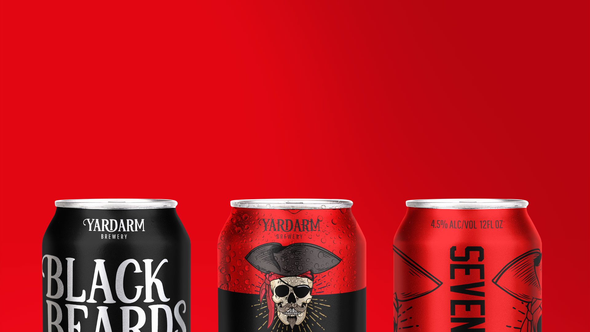
Crafting a beer brand
Having recently embarked on creating a brand for a new craft beer brewery, we asked Claire Baldwin to analyse the craft brewing scene in 2019, what styles are currently trending, and what you can do to stand out from an ever-growing crowd.
If you’ve been in a pub, bar or microbrewery lately, you’ll have likely noticed a few eye-catching beer designs. With the rise of craft breweries both in the UK and worldwide, even the most local of pubs seems to be offering a marshmallow milk stout.
Choices, choices
Beer is so much more than just lager, bitter or ale, and the endless choices can be pretty baffling. What’s the difference between an India pale ale and an American pale ale? Do you want a hoppy or a malty beer? What exactly is a sour and why does it taste so … sour?!
You might think that choosing a beer has become as complicated as choosing a bottle of wine. And how do most people choose a bottle of wine when they don’t know anything about wine? They pick the one with the coolest label.
Recent craft beer branding trends
There’s no denying that craft beer branding has been getting more and more creative, from intricate label designs to weird and wonderful pun names. Let’s look at a few trends that might get some ideas brewing for your own brand.
Unique colours for each beer
Lots of breweries are opting for a standard design across their range, using bold splashes of colour to differentiate between the brews. This offers a clean but clear look and makes it easy for both drinkers and bartenders to grab the one they want.

Minimalist designs
While lurid, eye-watering designs have grown in popularity, some breweries are starting to focus on sleek, modern designs that let the beers speak for themselves. Simple cans featuring little more than the brewery name and the type of beer give a sense of simplicity and sophistication that echo their contents. If everyone else is offering up designs that would make Jackson Pollock say “That’s a bit much,” stark white minimalism will make your brand stand out.

Bold and black
Again, seemingly in direct response to the bright, cartoony designs that have become prevalent, we’re starting to see more dramatic black bottles and cans on the scene. Bold, black designs are always going to make a statement. Whether you’re looking for an edgy vibe, a no-nonsense approach or a feeling of luxury, black can be pretty versatile.

So, how do you plan a craft beer brand?
If you’re serious about creating a craft beer brand that will really stand out and be successful, there are lots of things to consider. We recommend taking a look at the amazing and in-depth guide from American design agency CODO. It’s pretty lengthy, so here are a few key takeaways.
What are your core values?
There are countless breweries out there. What makes yours different? What do you stand for? What are you proud of? Are you a traditional brand or a playful one?
Think about everything that’s important to you and your brand, and try to come up with a handful of values that will govern everything you do for both marketing and day-to-day business practices.
Who do you want to buy your beer?
Like any business, you need to think about your target audience. Your brand will be heavily associated with its drinkers, so make sure that your name, packaging and marketing aim in the right direction. If you see yourself as a classy, sophisticated beverage for the older gentleman, you’ll attract a different crowd altogether if your cans are decorated in a playful, comic-book style.
What is your brand tone of voice?
Tone of voice is something that ties together all of your other decisions. Is your brew light and playful? Maybe your name and branding should follow suit. Another consideration is the names of your individual beers. Create a theme or opt for something wacky and memorable, and your customers will be able to recognise your beer from the name alone.

How do you convey your core values and tone of voice through design?
This is a hard task, and something that will require many meetings (ugh!), a handful of dodgy sketches and at least one trip back to the drawing board. For some brands, the task may be easier than others, so if you’ve got a gimmick or a local connection, run with it! For example, Nottingham’s Magpie Brewery has a range of ten seasonal beers that follow the traditional rhyme “One for Sorrow”. Of course, if you’re struggling, it’s worth contacting a branding agency to hash out a few ideas with you.

Some examples of great beer branding
It would be a bit weird if we didn’t look at a couple of examples of branding, right? Crack open a cold one and let’s get stuck in.
Beavertown
Beavertown is a London-based brewery that has become well known for its colourful can artwork.
Channeling something between a sci-fi B-movie and a post-apocalyptic nightmare, Beavertown’s cans are so unique that they tempt people to buy them just to get a better look. While each beer has its own bespoke illustration, the consistency of the design layout and art style makes them instantly recognisable.
This styling is naturally more appealing to some demographics than others, but if Beavertown is looking for a younger audience that loves cult movies and comics then they’re probably spot on.

Brewdog
Scottish-based beer brand Brewdog (try saying that five times after a few cans!) have made their mark on the craft beer scene with brightly coloured branding, quirky names, and a simple but memorable logo.
Brewdog employ a bold yet clean look to their bottles and cans, using a different eye-catching colour to differentiate each of their brews. The vertical text allows for large, bold letters that are legible from across the bar, and the familiar dog crest makes them easy to spot for Brewdog fans.

This fairly minimalist design means that branding up a newly crafted beer is a simple task, with no need to commission extravagant artwork and no fear that it won’t be recognised amongst the ranks.
A quality beer deserves a great brand
We know how important branding is, and how hard it can be to turn your values and abstract ideas into an actual brand. Working with DWH will allow you to benefit from years of expertise while still having creative input in the brand you’ve built.
Get in touch with us to find out more about working with us to craft your beer brand—and if we have to taste a few samples to get the feel for your brand, I’m sure we can be persuaded!


Turning negatives into selling points
Can you really take a negative and turn it into a selling point for your company? Claire Baldwin takes a look at some examples of intelligent and reactive marketing that have done just that.
It’s often said that all publicity is good publicity; even if people are saying bad things, at least they’re actually talking about you.
While this might not be the case in extreme situations, being relevant and in the public eye can give your brand real mileage. It might be preferable to be notorious than forgotten.
The cleverest marketers are able to ride the momentum of negative publicity and turn it into something positive. By reacting quickly to the influx of attention, you’re able to place something worthwhile in the spotlight while the media and public are still paying attention.
Let’s take a look at a couple of examples of creative marketing that turned negatives into positives.
KFC
Over the years, fast food chain KFC has received a lot of criticism over its fries, which many customers feel don’t stand up to the quality of their chicken, or to fries from other fast food chains.
As with most subjects, turning to Twitter yields a variety of negative comments:
“Dear KFC, No one likes your fries. Yours sincerely, The entire world.”
“I’ve got to say, KFC are riding solely on their chicken because Christ, those are crap fries.”
“how can KFC be so good at chicken and so bad at fries?”
Along with creative agency Mother, KFC took this criticism and turned it into teaser posters promoting a new fry recipe. The ads took these direct quotes and even included the authors’ Twitter handles, showing the world that they listen to and value feedback.
By taking a product that was poorly received and improving it, the ‘Ain’t No Small Fry’ campaign aimed to convert their fry-haters into fry-lovers. This approach had the benefit of bringing old customers back through the doors to try the new version, while giving those who still regularly eat at KFC something new and exciting.
TCP
I might be showing my age a little here, but when I was a child my mother seemed to be constantly dabbing TCP on my various cuts, grazes, spots and sores. I have very vivid memories of this because TCP absolutely stinks. And if you’ve had the misfortune of using it for toothache then you’ll know it tastes disgusting as well.
Of course, I learned that, like broccoli, it tastes bad because it’s good for you. The stuff works. It’s just terribly unpleasant.
Which is why I couldn’t help but smile when I saw this advert for TCP with the strapline “Tastes as foul today as it always has.”
How often have you read reviews online where customers complain that a new formula of something doesn’t work as well as the old one? From lipstick to chocolate, reviews are riddled with ‘improvements’ that have backfired due to a company’s need to cut costs or improve a product’s nutrition.
This ad reassures existing TCP customers that the pungent brown antiseptic is still just as gross as ever, meaning it’s just as effective. It also sparks curiosity in those who aren’t familiar with the product and might wonder why on earth you’d put that on your own advert.

Creative marketing with DWH
It can be difficult to see your own products and services from a new angle, but DWH are here to find the individuality in everything you do. Together, we can embrace all aspects of your business and promote them in the best light.
Contact us today and let us know how we can help.
We are also pleased to announce we have been recognised by DesignRush in their list of Top Branding Agencies in 2019. You can check out the full list here.
Show your true colours
Pantone’s Color Institute has dubbed ‘Living Coral’ the colour we’ll all be using in 2019. With this in mind, Claire Baldwin analyses the importance of colour in the branding process and asks if a brand can really ‘own’ their colour?
Pantone’s Color Institute has dubbed ‘Living Coral’ the colour we’ll all be using in 2019. With this in mind, Claire Baldwin analyses the importance of colour in the branding process and asks if a brand can really ‘own’ their colour?
Pantone’s Color of the Year has set trends in many industries for the last 20 years, contributing to style decisions in everything from fashion to packaging..
Living Coral was chosen in response to our “continually shifting environment” and hints at embracing and regenerating our planet’s natural beauty. It’s been described as an “animating and life-affirming coral hue with a golden undertone that energizes and enlivens”.
Colour in branding
This all sounds very appealing, but be wary of jumping on the Living Coral bandwagon just because it’s the Color of the Year. Embrace it if you want to, but don’t overthrow your existing branding just to be trendy.
Colour is extremely important in branding, and consistent branding is key to creating a sense of trust and familiarity.
How many brands do you associate with the colour of their packaging or logos? Would you still recognise an ad for Coca-Cola if they used Living Coral instead of their signature red shade?
Can brands own a colour?
You might have heard of trademarking a colour, but do brands actually have any legal right to do so?
The answer isn’t completely black and white (forgive the colour pun) but, in short, the answer is yes … sometimes.
For a long time, colour wasn’t seen as being distinctive enough to act as a trademark. This was resolved by the World Trade Organization Agreement on Trade-Related Aspects of Intellectual Property Rights, Article 15(1), which expanded the legal definition of a trademark to include “any sign … capable of distinguishing the goods or services of one undertaking from those of other undertakings”.
What this means is that where the colour (or combination of colours) is distinctive enough to distinguish the product or company from another similar product or company, the colour could be legally trademarked.
Companies may use similar colours without dispute if their products or services are unlikely to be confused. For example, the US department store Target uses a similar red to Coca-Cola, but the companies are different enough to prevent confusion.

Colour wars
Disputes about trademarked colours pop up in the media from time to time, but they aren’t always easily solved. Here are a couple of examples.
Christian Louboutin vs. Yves Saint Laurent
In 2012, Christian Louboutin filed a case against Yves Saint Laurent for producing a red-soled shoe, claiming that the red sole is a trademark of their brand.
The US Federal Court of Appeals ruled that Louboutin’s trademark could only apply where the rest of the shoe was a colour other than red. This meant that YSL’s all-red shoe was not a trademark violation, but Louboutin could protect from future copycats.

Cadbury vs. Nestlé
Cadbury trademarked their distinctive purple back in 1995 but this only covered “chocolate in bar or tablet form.” Cadbury sought to amend this in 2004 to cover products such as cakes and drinking chocolate.
The original phrasing of the trademark application read: “The mark consists of the colour purple (Pantone 2685C) … applied to the whole visible surface, or being the predominant colour applied to the whole visible surface, of the packaging of the goods.”
Nestlé, who also use purple for some of their products, opposed the trademark, stating that Cadbury’s purple shade had no distinctive character and was too broad for a range of products.
The UK Court of Appeal overturned Cadbury’s trademark in 2013. They stated that in the phrasing of the trademark description, “being the predominant colour” was too broad and did not accurately define the mark.

Designing brand excellence
Your branding defines your business. It distills your company ethos, services and values into a cohesive look and feel that tells people who you are and what you’re about.
If you’re looking to make a change to represent a new era, or you need help creating a comprehensive brand from scratch, get in touch with us today.
Do they know it's Christmas?
As UK Christmas TV ad spending is projected to fall by as much as £44m this quarter, Claire Baldwin looks at the latest campaigns to separate the Christmas turkeys from the golden goose.
UK TV ad spending is projected to fall by as much as £44m this Christmas, with companies rerouting that money to more modern methods instead. Facebook, Google and YouTube are set to be the focus this year as retailers try to compete with online competition.
Despite this, we were still treated to the usual weird and wonderful Christmas ads that we all look forward to. Let’s take a look at some of the more noteworthy offerings this year.
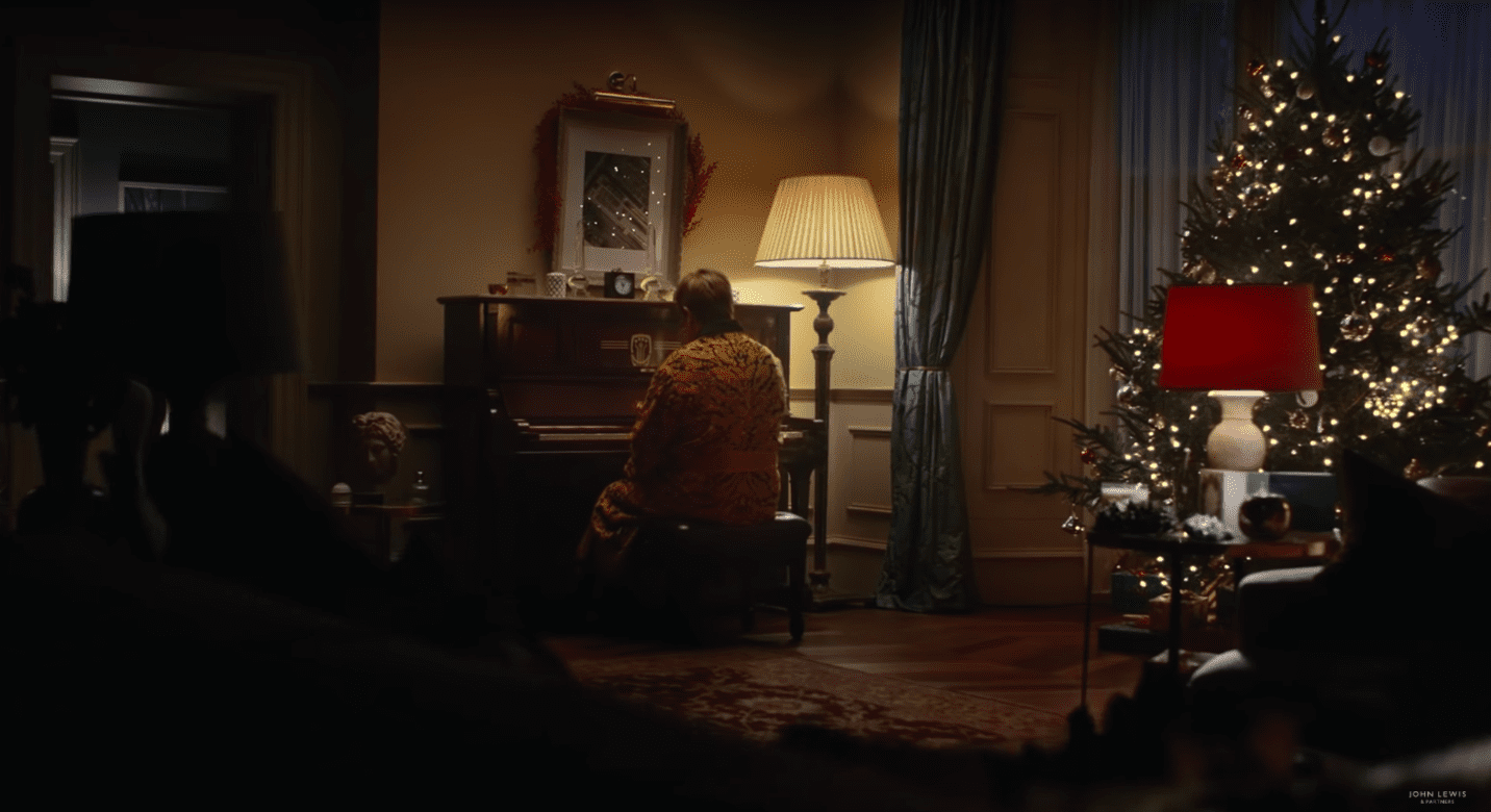
John Lewis
Perhaps the most eagerly anticipated Christmas ad in the UK, the department store has taken a different approach this year. Gone are the cute and whimsical characters, with the advert instead revolving around singer Elton John.
We see the singer’s career in reverse, from huge stadium shows to his beginnings as a musician, all the way back to a piano recital at school. The end shows a young Elton John unwrapping a piano on Christmas morning. The line pops up: “Some gifts are more than just a gift.”
Rather than focus on consumerism and excess, the advert hints towards meaningful gestures that change futures and shape lives.
Festive feeling: 2/5
Warm and fuzzy factor: 3/5
Message: 4/5
Iceland
The advert has been banned for being “too political” due to its focus on the environmental impact of palm oil. This is surprising for a supermarket that has never been known to have any kind of political view, but less surprising when you learn that the advert was originally created by Greenpeace.
The animated ad features a girl who has found an orangutan in her room, and is poetically narrated by British actress Emma Thompson. This poem turns from charming storybook to an eye-opening look at deforestation and habitat loss caused by palm oil production.
The advert concludes with Iceland’s promise to remove all palm oil from its own-label products “until all palm oil causes zero rainforest destruction”.
While the message is important, some people felt that hijacking the Christmas advert season to make a political point isn’t particularly festive. It’s definitely grabbed media attention, though.
Festive feeling: 1/5
Warm and fuzzy factor: 1/5
Message: 4/5
Burberry
The luxury fashion brand is known for its decadent adverts packed with famous faces, and this year is no different. 2018’s ad features Kristin Scott Thomas, Matt Smith, M.I.A, Naomi Campbell and her mother, Valerie.
Accompanied by the somewhat haunting ‘Carol of the Bells’, this characteristically beige advert was shot by British artist and photographer Juno Calypso. It is intended to capture “a more realistic British Christmas” taking the viewer through “all the key seasonal rituals, both good and bad.”
It’s a very stylish Christmas advert with a strong focus on the brand’s clothing and accessories, but it doesn’t really bring a sense of holiday joy. If anything, it might leave you dreading that traditional family dinner!
Festive feeling: 2/5
Warm and fuzzy factor: 2/5
Message: 2/5
Sky Cinema
TV giants Sky have put family movie night at the heart of their Christmas ad. With voiceover by Patrick Stewart, the advert opens on a large apartment building with its windows numbered like an advent calendar. We visit the various homes and see a glimpse of their Christmas decorations and festive movie choices.
It ends with the line “Movie magic on demand this Christmas” and promotes a lovely message of spending time with family and loved ones. While it may have been nice for all of the movies to be traditional Christmas movies, Sky obviously needs to advertise the availability of recent blockbusters as well. This does make the concept feel less festive, though.
Festive feeling: 4/5
Warm and fuzzy factor: 3/5
Message: 3/5
What’s your message?
Whether you’re sharing a Christmas message or simply marketing your brand, creative thinking is essential to get you noticed and remembered.
DWH Design can help you to turn your products and services into unique content that converts. To find out more about our copywriting services and content generation, get in touch, and take a look at our case studies to find out what we’re capable of.
When bold copy goes too far
LAST MONTH, WE TOOK A LOOK AT HOW COPY CAN CHANGE THE AD INDUSTRY, FOCUSING ON NIKE’S DREAM CRAZY CAMPAIGN. THIS TIME, CLAIRE BALDWIN LOOKS AT EXAMPLES OF WHEN BOLD COPY MISSED THE MARK AND RESULTED IN MORE OF A NIGHTMARE THAN A DREAM.
Carefully chosen words are the backbone of marketing campaigns. They allow you to get your message across, give your company a voice and explain why customers need you.
Make a statement. Stand up for something. Show the world why your brand is unique.
But… try not to be a jerk about it.
We all like to hear about catastrophic failures, partly because it’s entertaining but it’s also a great way to learn what not to do! Let’s look at some bold ad copy that could have been a little gentler and see what we can learn.
Lesson 1: Don’t insult your customers
Highlighting the problems that your product can fix is a common way to persuade people to try it, but it’s important to use the right tone. Get it wrong, and you end up humiliating or criticising your potential customers.
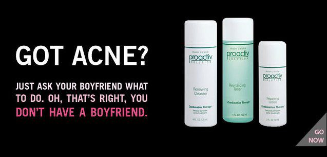
In 2012, skincare brand Proactiv received backlash for an advert with the text: “Got acne? Just ask your boyfriend what to do. Oh, that’s right, you don’t have a boyfriend.”
While many skincare and cosmetics brands could be said to play on people’s insecurities, this one doesn’t exactly promote a healthy message. It also just comes off as pretty mean!

In 2011, The Economist tried to increase their female readership with an advert that read: “Why should women read The Economist? They shouldn’t. Accomplished, influential people should read us. People like you.”
While you can kind of see what they were going for, there were surely many better ways to make the statement more clearly. Something along the lines of: “Why should women read The Economist? Because it’s for accomplished, influential people.” It’s not perfect, but it does a better job of not doing women down.
Lesson 2: Don’t joke about serious issues


Spirit Airlines got in trouble in 2010 for an advert that seemingly made light of the BP oil spill, with the line “Check Out The Oil On Our Beaches.” Although the airline claimed that the message was misinterpreted, many weren’t convinced.
Spirit had already caused controversy with previous ad campaigns, including one that advertised “Strikingly Low Fares” in reference to their own pilots’ strike.


In 2013, Hyundai launched an advert in the UK that was supposed to celebrate the fact that their sedan doesn’t produce harmful emissions. In a fascinating lapse of judgement, they chose to show this through a man’s failed attempt to take his own life and the slogan: “Our cars are so safe you can’t even commit suicide in them.”
Being bold is one thing but belittling serious issues is just going to anger and alienate customers. Remember that you are selling to real people with real lives, and experiences both good and bad. If there’s any possibility that what you’re planning might cause offence or evoke a traumatic reaction, you should scrap the idea.
Lesson 3: Don’t forget how your words sound to customers
Creating a marketing campaign doesn’t happen overnight and can take months or years. It’s easy to lose sight of how things might look or sound to people that weren’t present in all of your brainstorming sessions.
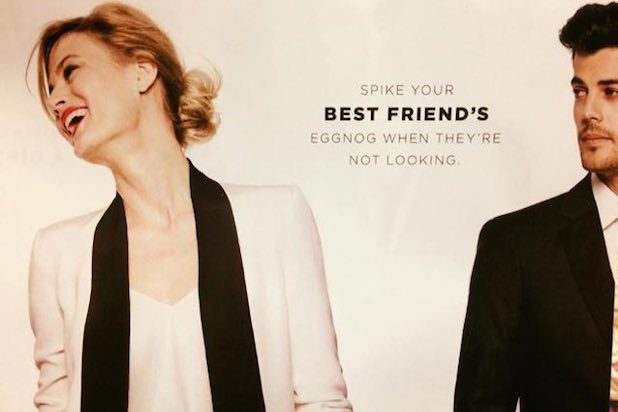
US department store Bloomingdale’s caused outrage in 2015 with a Christmas catalogue that cheerfully suggested “Spike your best friend’s eggnog when they’re not looking.” Understandably, this was poorly received.
Bloomingdale’s were trying to be fun and lighthearted, adding an attempt at cheeky humour to their catalogue. The result was an advert in poor taste that got them accused of suggesting date rape as a festive activity.
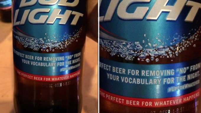
In 2015 Bud Light launched their Up For Whatever campaign. This was accompanied by the tagline: “The perfect beer for removing the word “no” from your vocabulary for the night.” Yikes. I’m sure you can see what’s wrong with that…
The key takeaway
Trying to be fun, quirky and different in your copy is great, but always think through the implications of what you’re saying. Make sure you run the ad copy past as many diverse people as you can to highlight areas of friction that might have been missed.